


Sector
Technology/Communications
Deliverables
Branding, Strategy, Campaign, Events, Publications, Websites
INSIGHT
B2B tech brands often struggle to convey scale, innovation, and reliability through conventional design systems.
CHALLENGE
Following a corporate restructuring, SES needed to consolidate its operations—merging SES Astra and SES World Skies—under a single brand and management structure. The challenge was to redesign SES’s brand identity to reflect its global leadership in satellite communications while ensuring clarity and consistency across all touchpoints.
SOLUTION
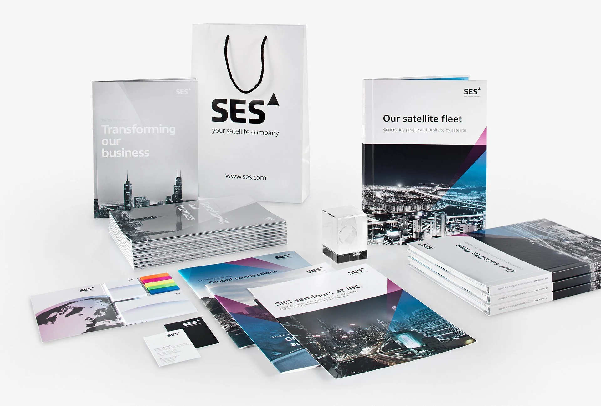
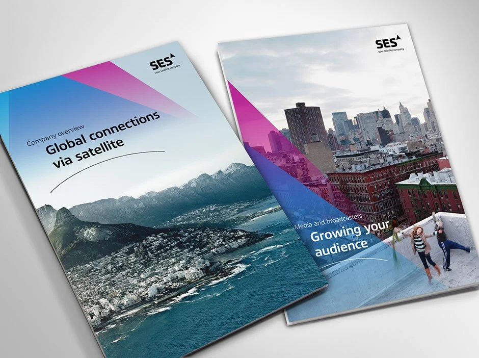
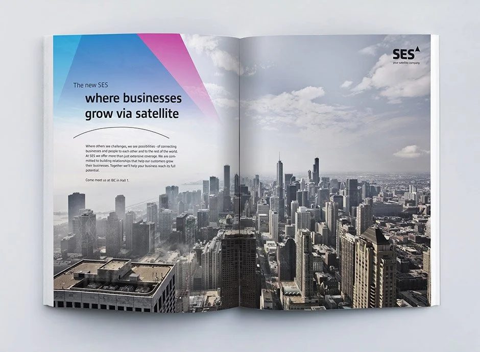
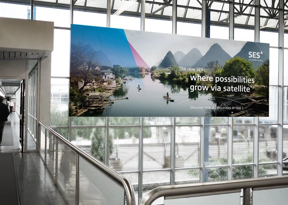
Developed a cohesive visual identity system—including logo, typography, and brand guidelines—that unified SES’s legacy brands into a scalable, future-ready framework. The new identity articulated SES’s technological expertise and global reach, while remaining accessible to diverse stakeholders. Led the design of web, print, and digital assets to ensure consistency and strengthen SES’s positioning in the global market.
STRATEGY
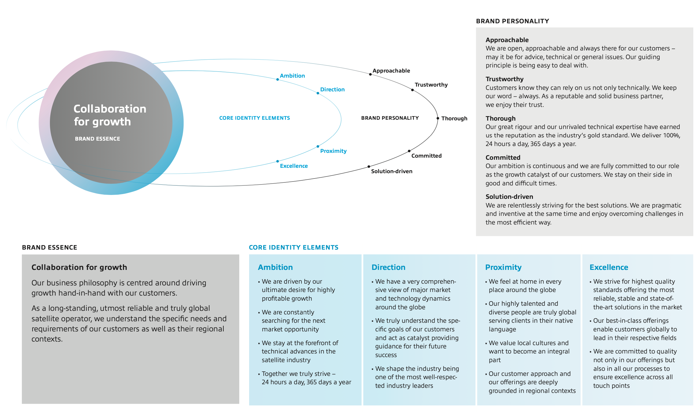
The business decision to align all divisions of the SES organization under a single management structure necessitated the creation of a powerful SES master brand on a global scale. The SES master brand is instrumental in achieving improved clarity and consistency of offerings towards different customer segments and their specific needs. While optimally serving existing segments and future growth areas, it is designed to leverage synergies between different offerings.

DESIGN
Basic Elements
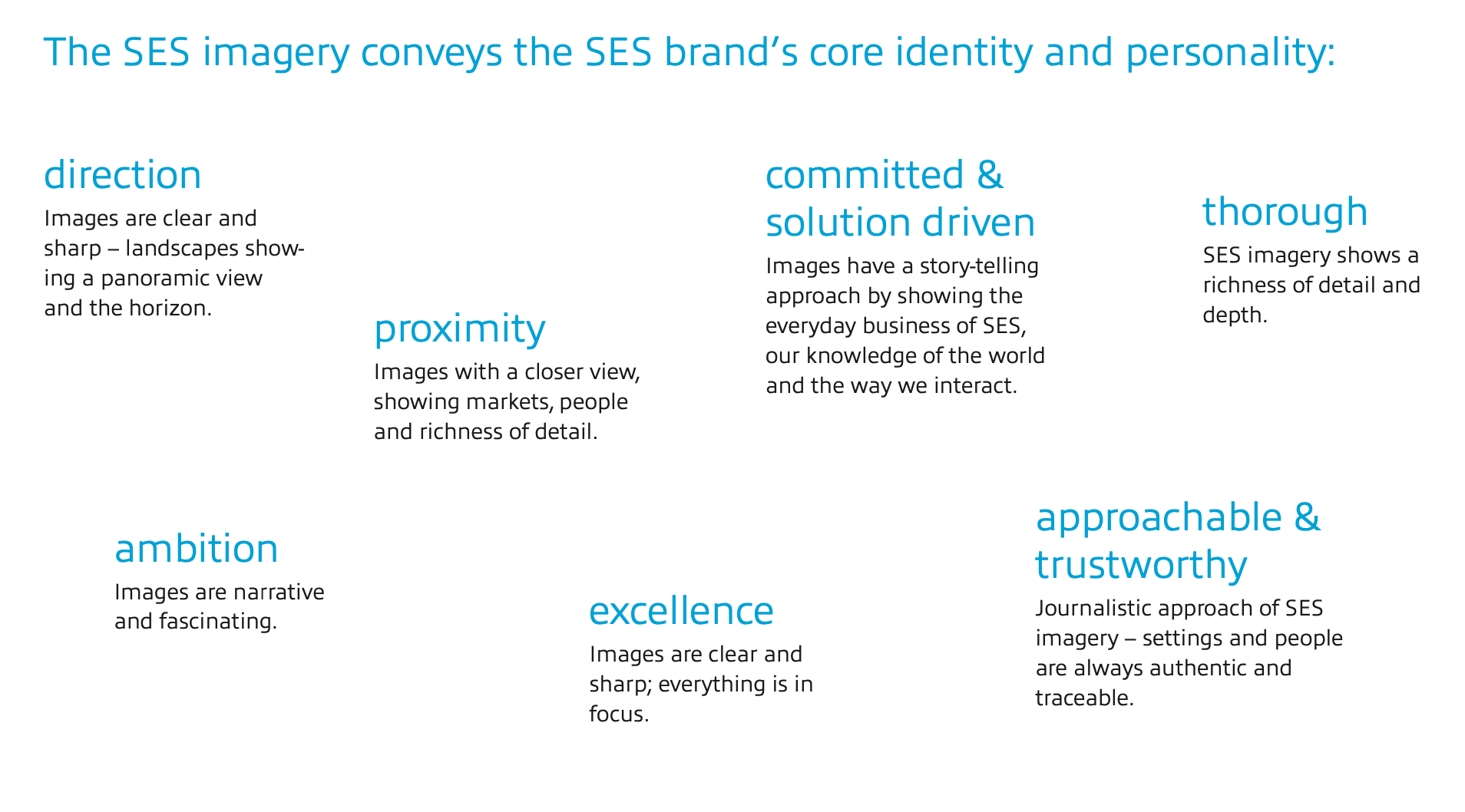
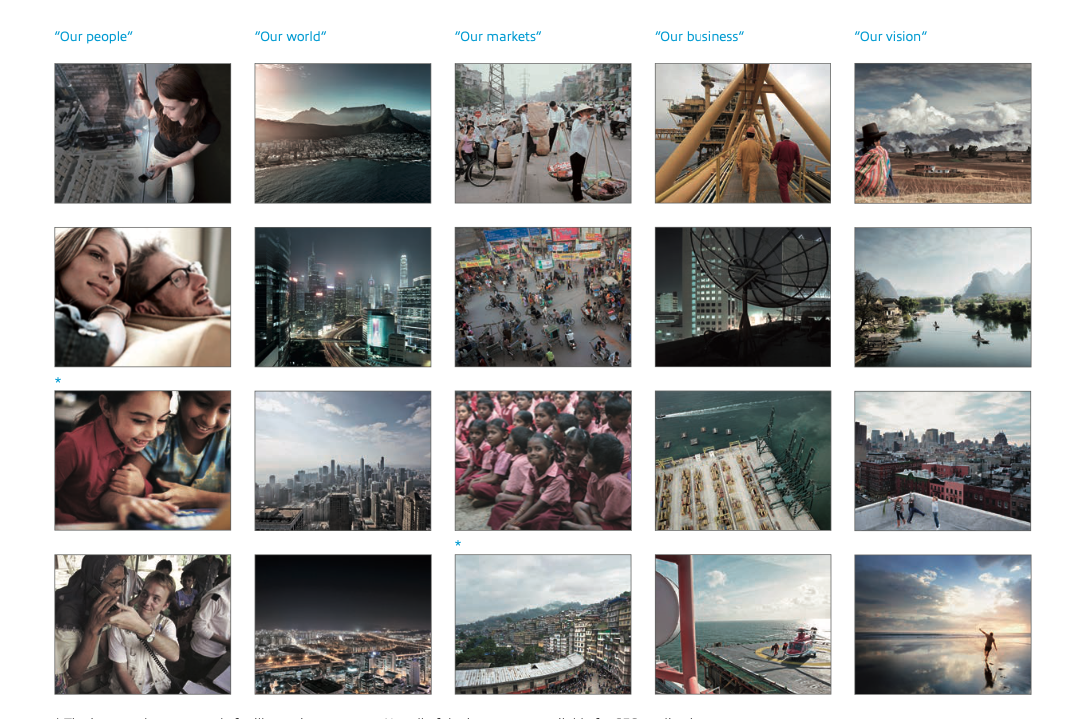
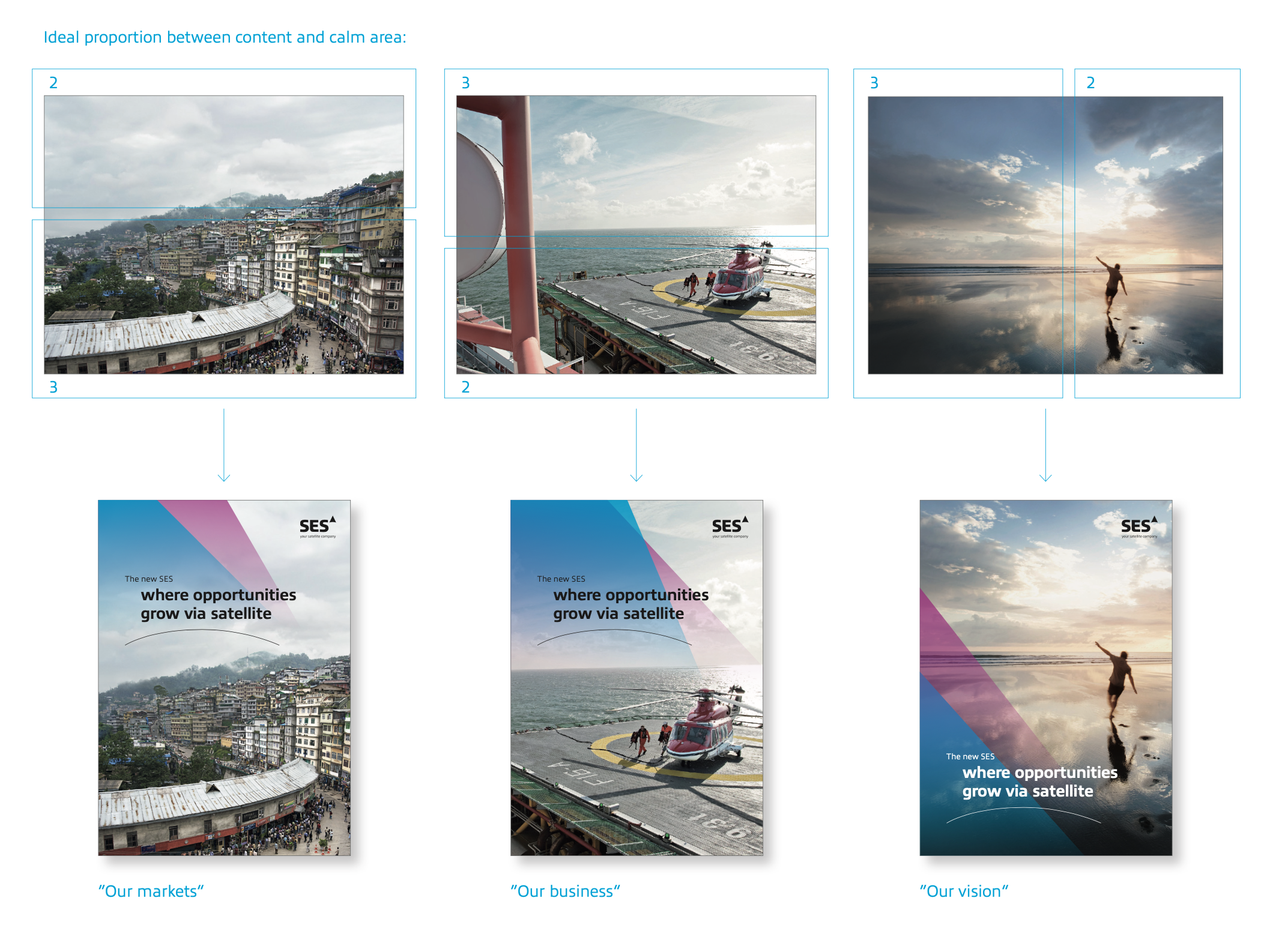
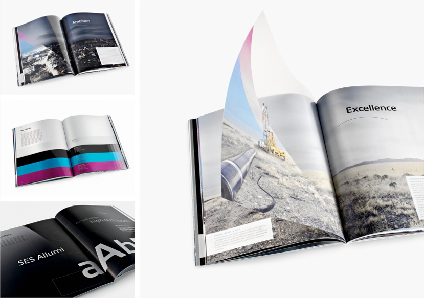
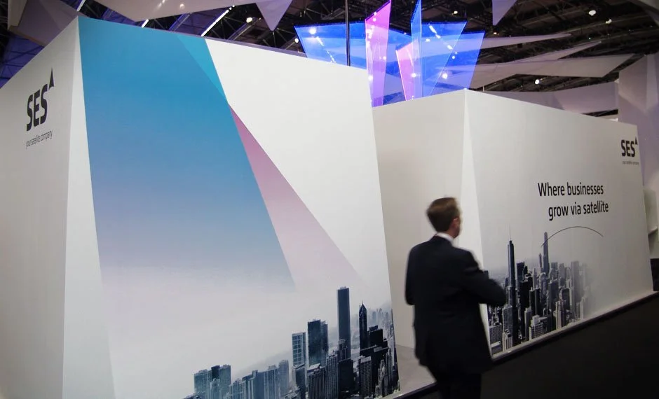
The brand’s key visual element is the beam, it shows the way forward and moves beyond borders.
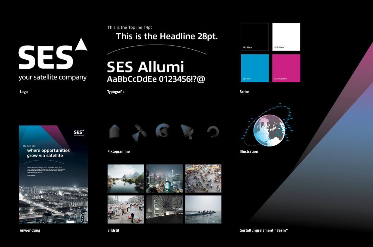
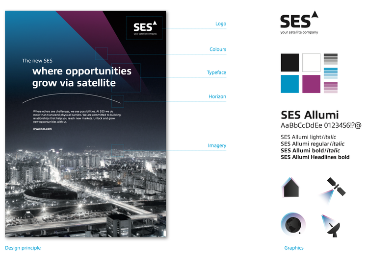
The beam is predefined in a beam shape with two layers, transforming everything it touches, thus revealing the positive impact of SES.
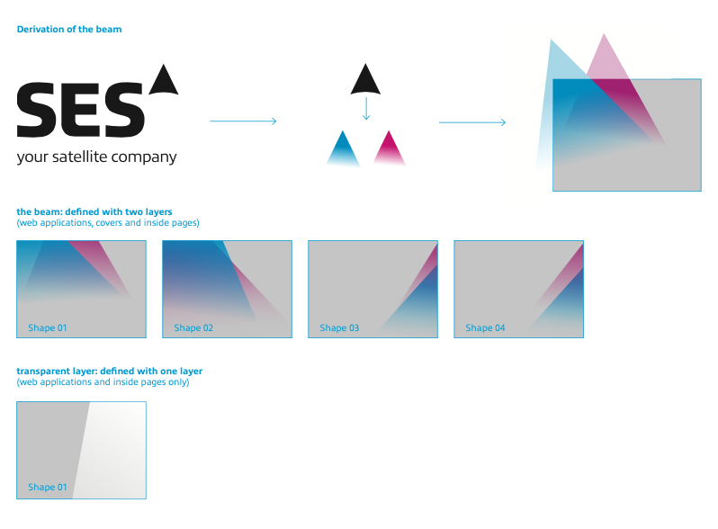
There are four different beam shapes predefined in SES Blue and Magenta. The SES Blue is the predominant color and always used as the front layer, SES Magenta is the second layer in every beam shape.
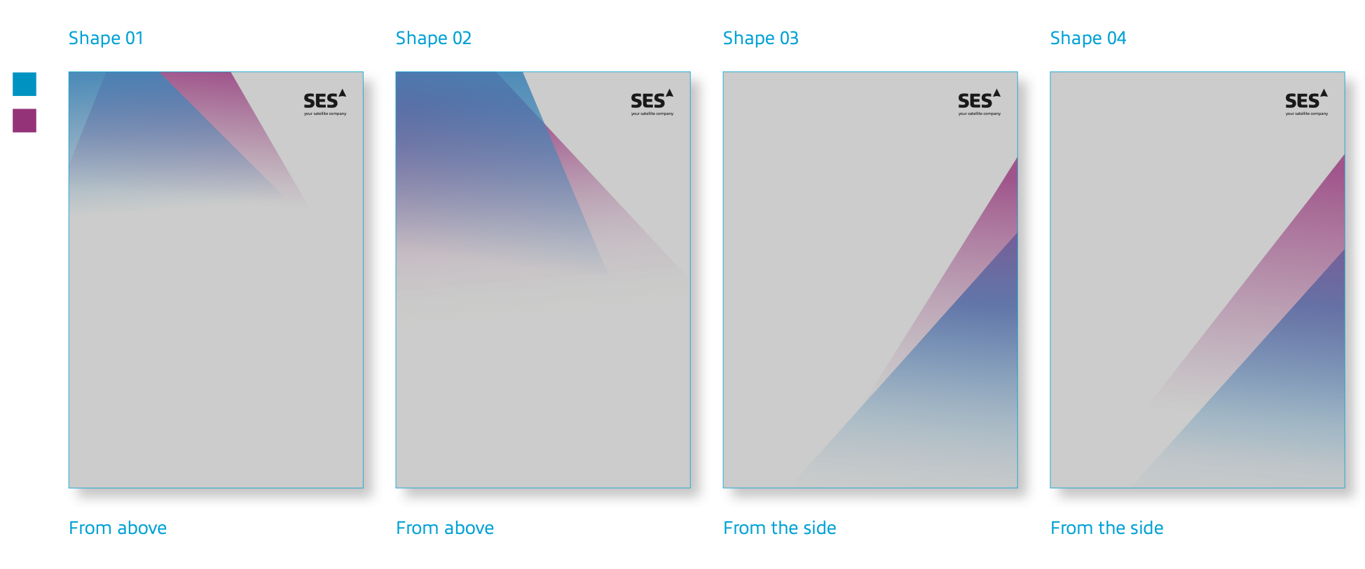
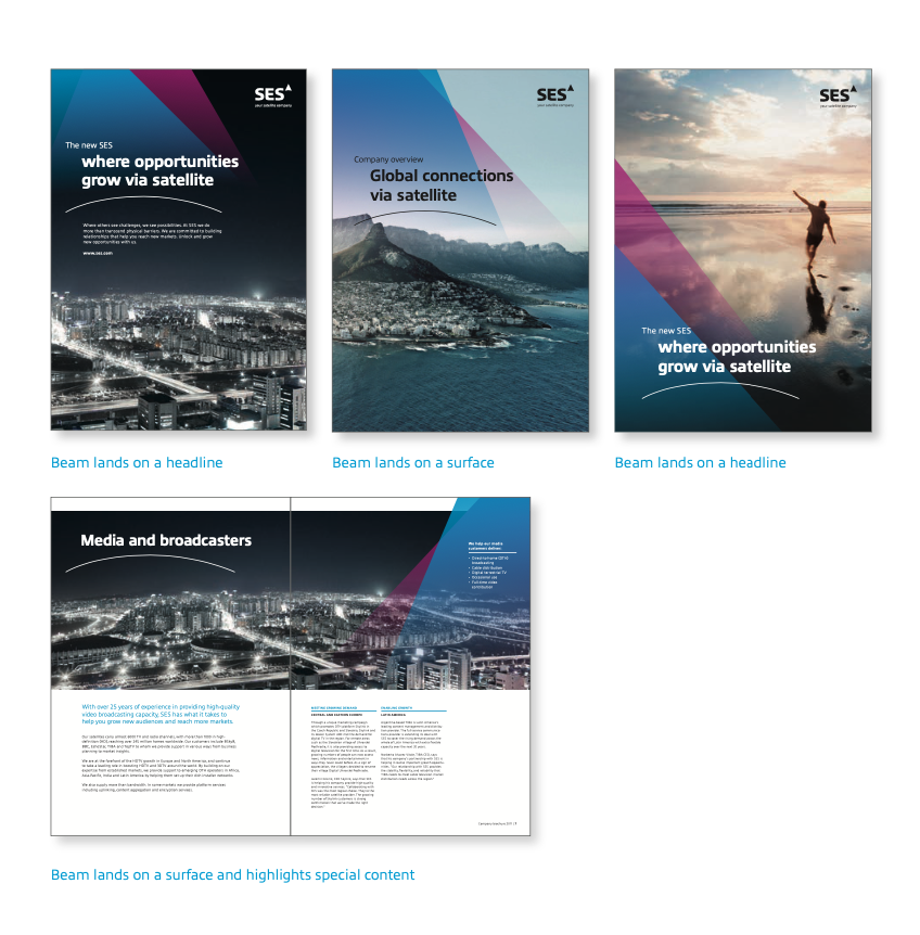
The beam can be placed on light, medium and dark images. The image should be chosen so that the background colour doesn‘t conflict with the beam.

BRAND ELEMENTS
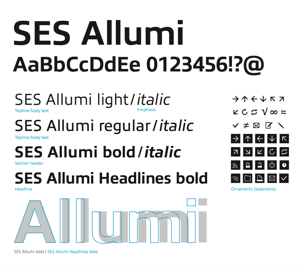
The symbol (beam) unifies SES into one strong umbrella brand. The typography conveys approachability and combines technology with a human touch, as seen in the contrast of sharp and rounded edges in all letters.
SES Allumi is a sleek typeface designed with technology in mind. The SES Allumi shapes are neither perfectly round nor geometrically square. It’s a human design with a high tech touch.

DESIGN SYSTEM


DIGITAL DESIGN


RESULTS
SES is focusing on worldwide growth and a globally unified brand. MetaDesign worked with the satellite provider to develop a completely new look in only three months – one that will now carry the company into the future and has already won the Corporate Design Award and the Rebrand award.
Key Learnings
Creating a comprehensive design system by translating brand strategy into cross-media execution, including print, digital, environmental, and campaign assets.
Applying knowledge of branding methods and best practices with a demonstrated ability to interpret and implement brand guidelines consistently.
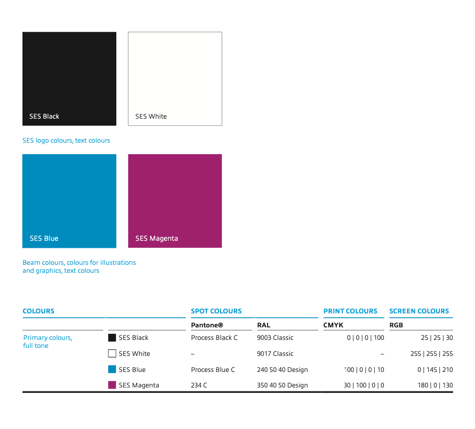
Assisting with preparation of files for optimal online use and print, bleed areas, CMYK, Pantone, RGB with an understanding of different pixel resolutions required for print and online.