

A newsletter system built to explain hard science in one scroll
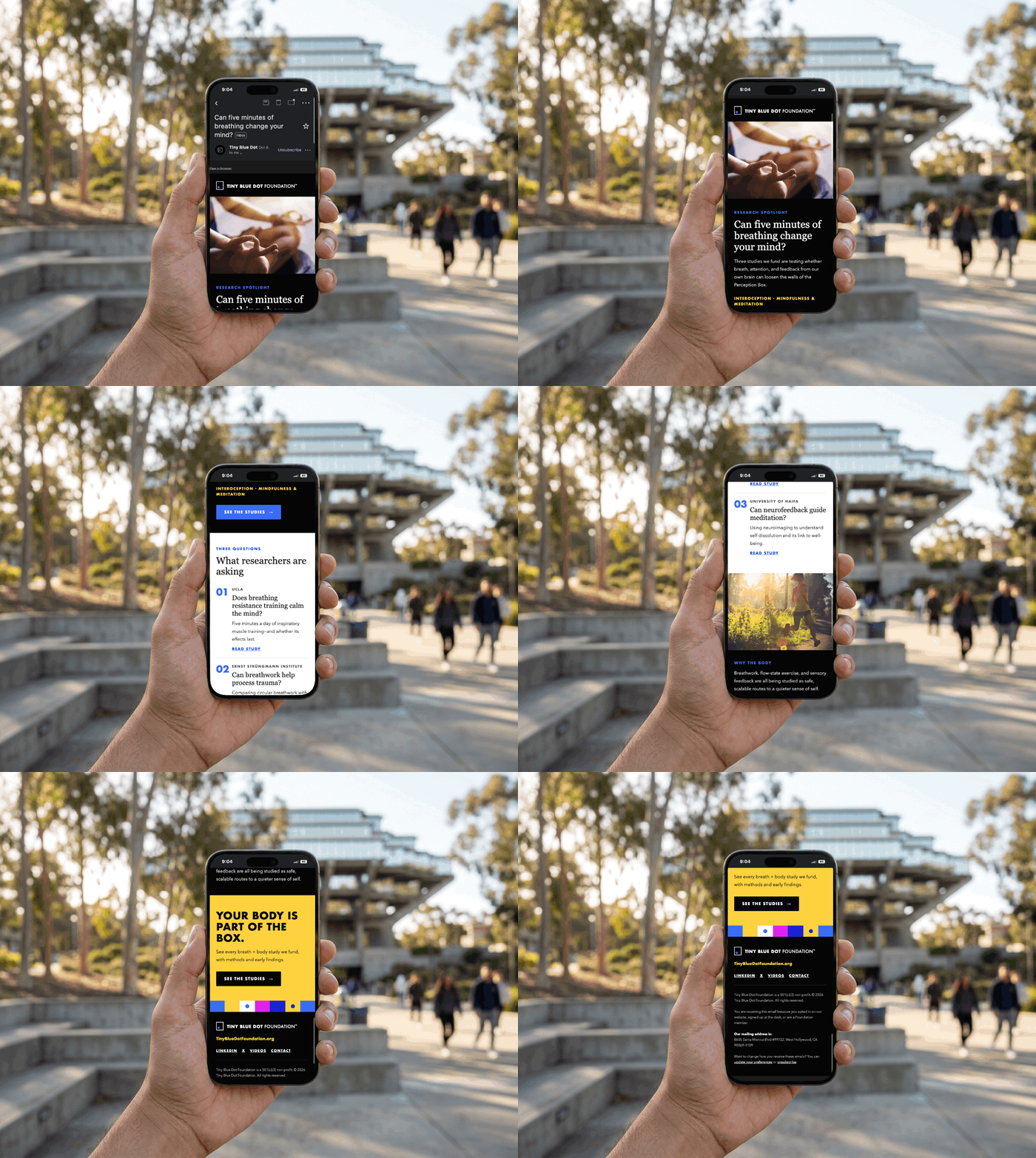
TBD needed to reach researchers, donors, and the curious public without sounding overly academic, so I designed and hand-coded a set of modular email templates that work in every major inbox.
CLIENT
Tiny Blue Dot Foundation
SECTOR
Nonprofit Sector (scientific research, neuroscience, mental health, and human well-being)
ROLE
Digital Designer: Layout, Template System, HTML Build
SERVICES
Email Newsletter
CHALLENGE
Tiny Blue Dot Foundation operates in a complex scientific space; researching perception, consciousness, and neuroscience, where credibility and clarity are essential. Communicating this work to multiple audiences (research applicants, donors, and collaborators) required an email newsletter that could feel rigorous and trustworthy without becoming overly academic or inaccessible.
KEY CONSTRAINTS
Email is not the web. These limits were set before any visual decisions, and every module was built to work within them.
OPPORTUNITY
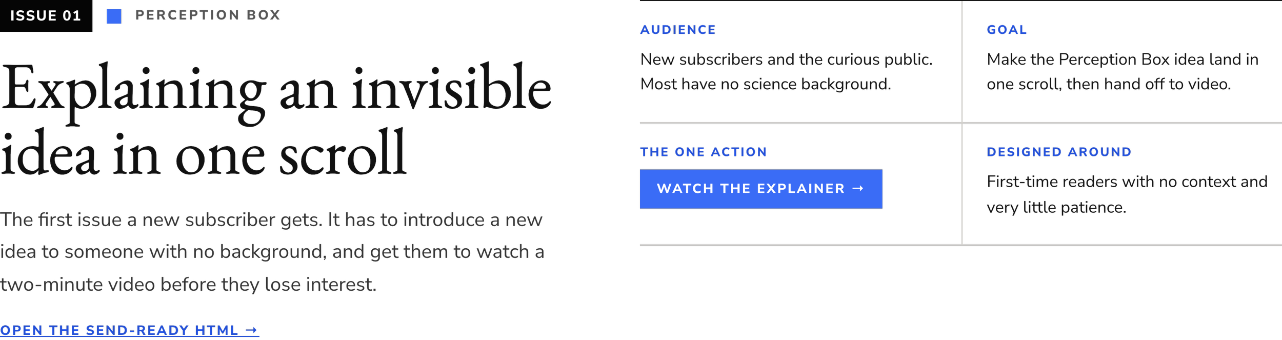
A newsletter template system for a neuroscience foundation, used for two issues. Each one has to explain a hard idea, survive Gmail, Outlook and a 375px phone, and get a busy reader to click one thing.
A CLARIFIED NEWS LETTER
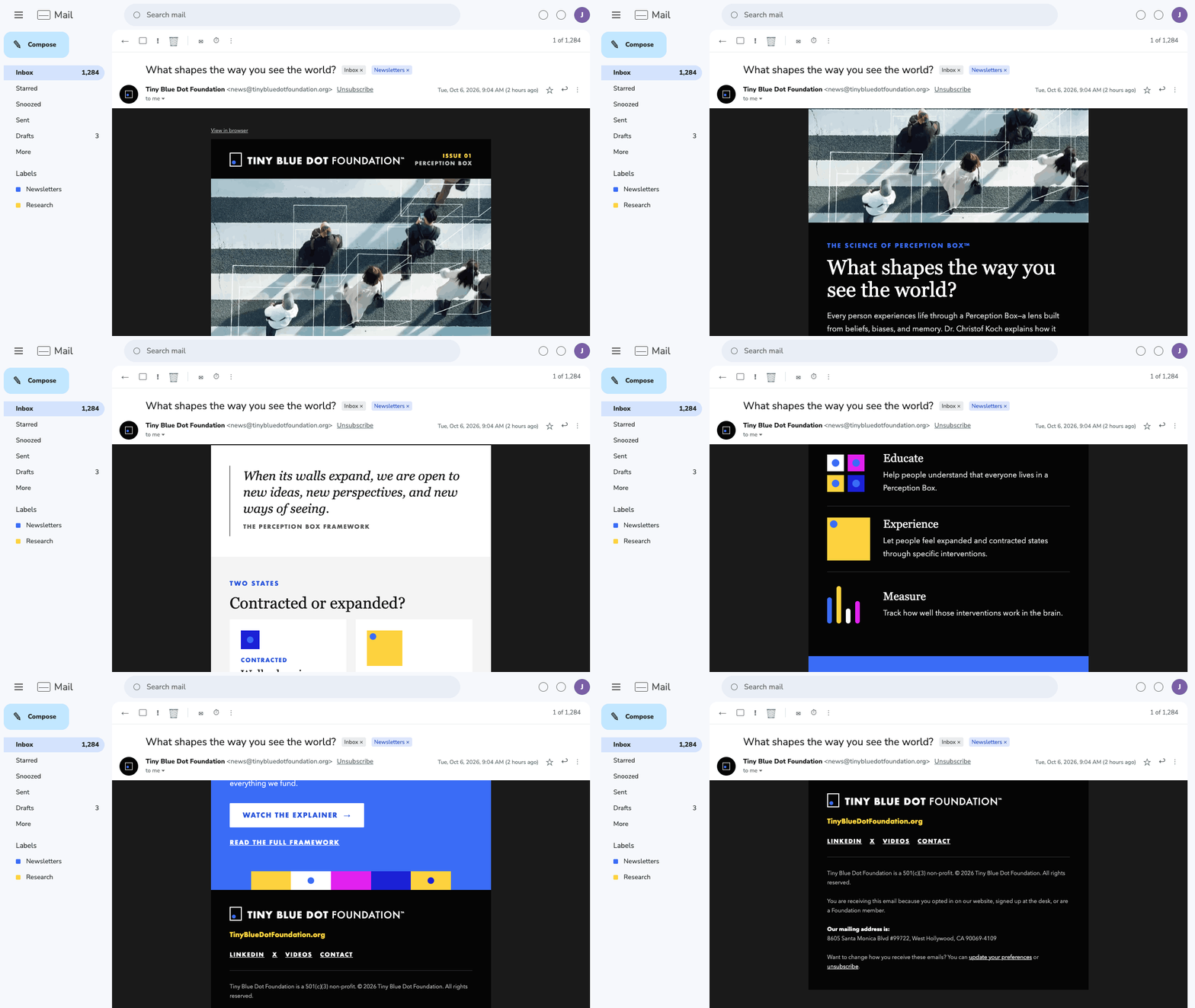
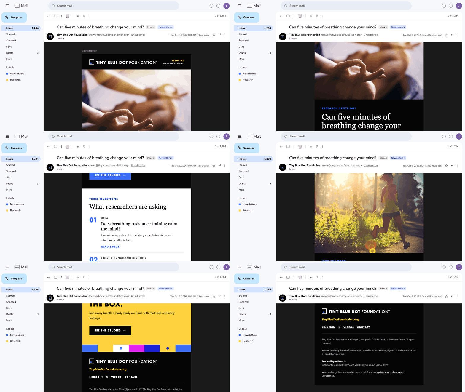
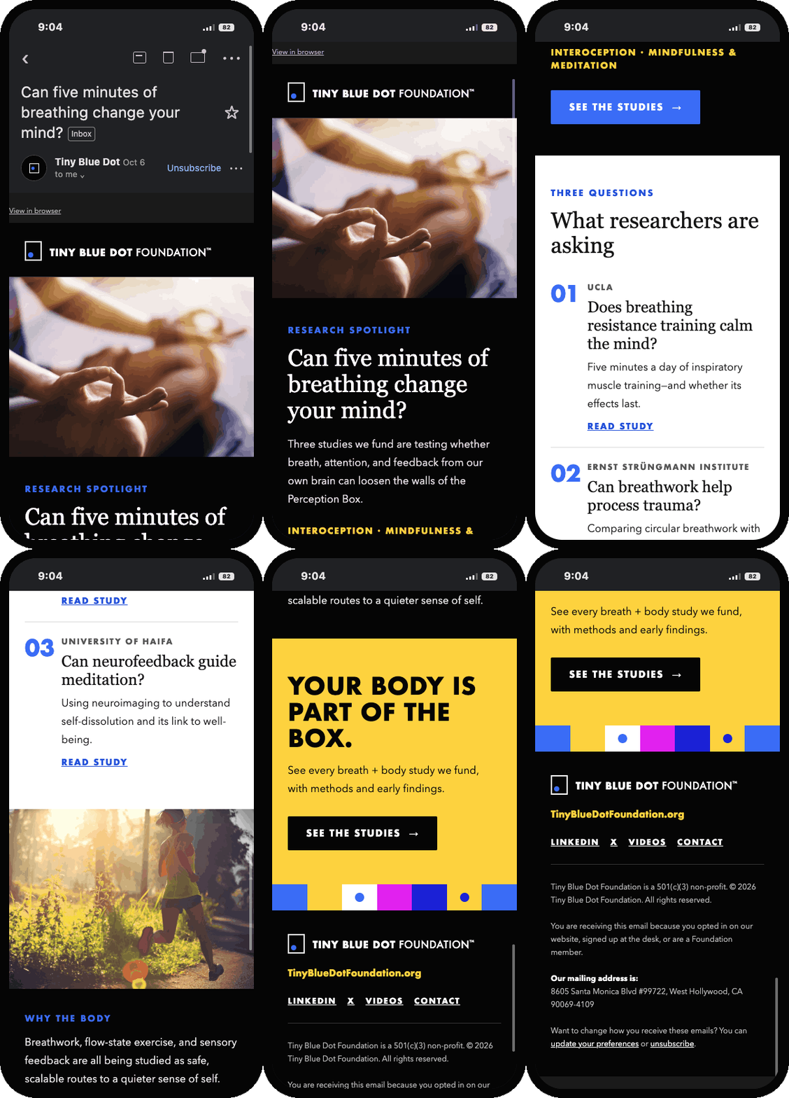
Each issue is built from the same set of stacked modules.
The masthead, primary call to action, brand band and footer never change.
Everything in between is picked to fit the content.
OUTCOME
A reusable system: 13 modules that make up two issues. Any new issue can be assembled from them without designing from scratch.
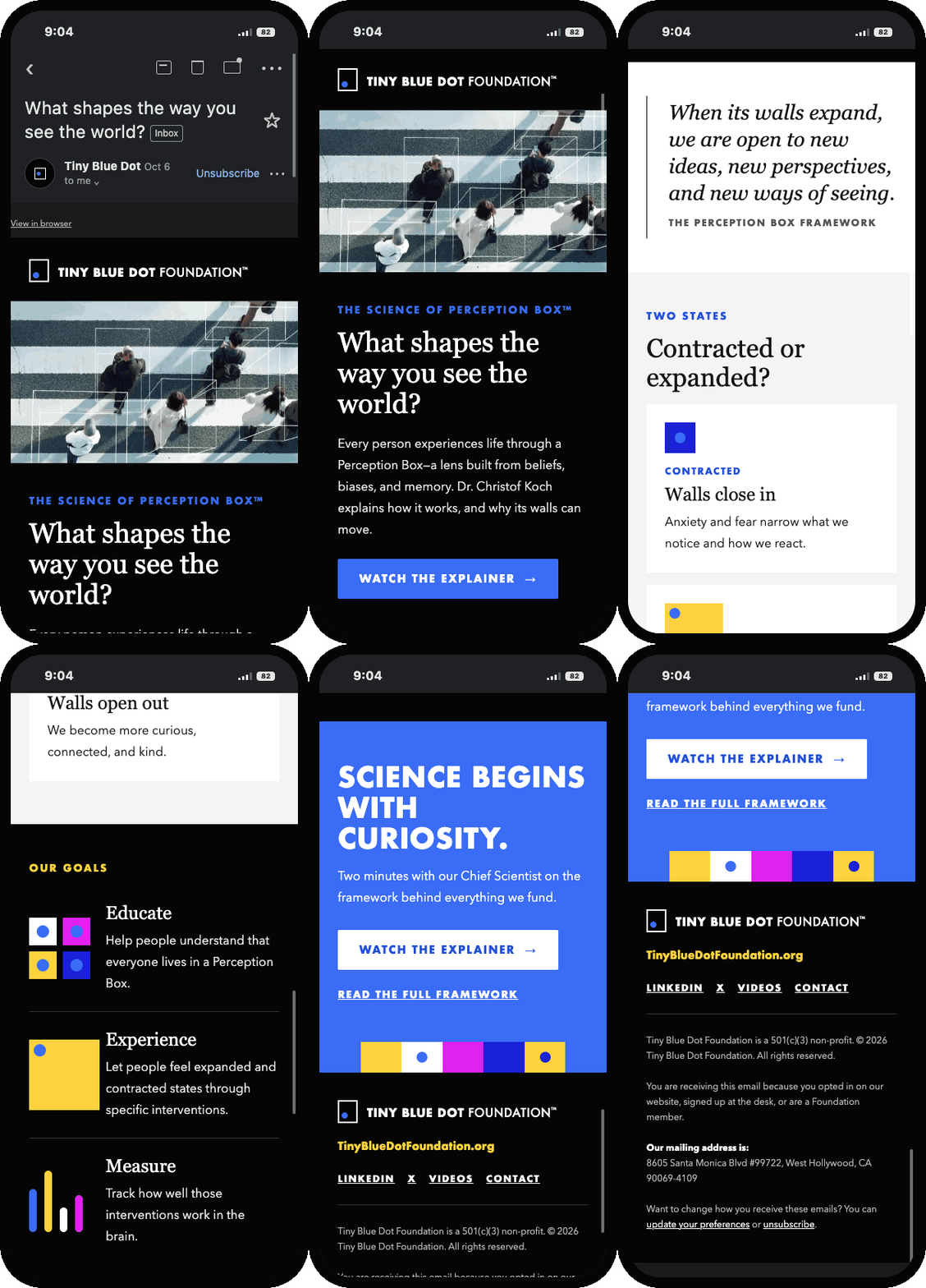
Five send-ready emails: hand-coded HTML for Mailchimp, built to work in Gmail, Outlook and Apple Mail, on a 375px phone, with images off and in dark mode.
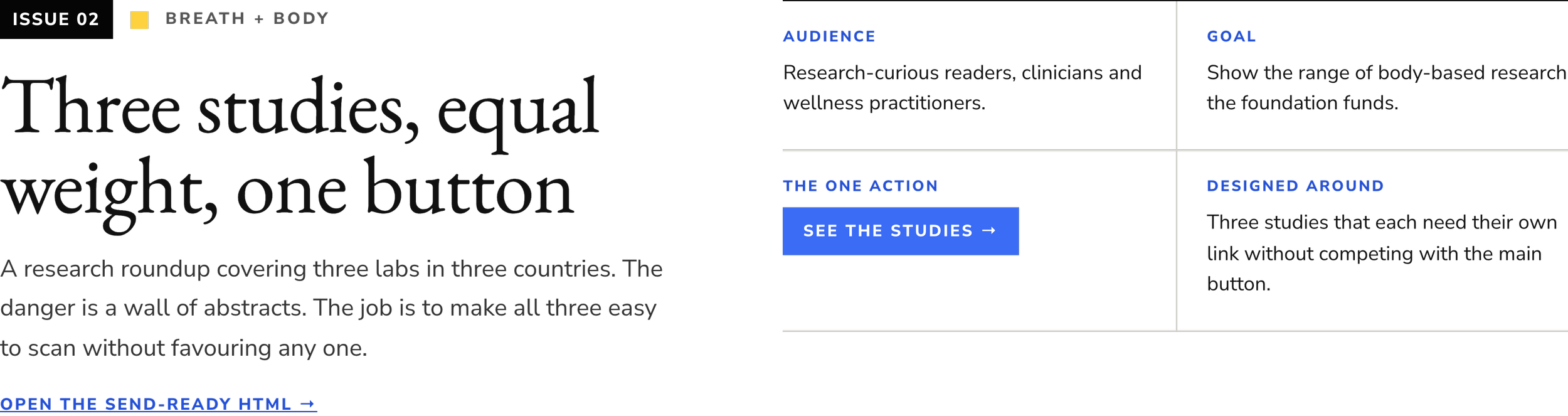
One action per issue: each email has a single button label, repeated at the top and bottom. Everything else is a text link.
Under Gmail's limit: each issue is about 18–24KB, well under the size where Gmail cuts off the bottom of an email (~100KB).
Faster to read: the copy was cut by about half after checking it against newsletter best practices, so each issue can be skimmed in under a minute.
QUOTES
“Researchers on a deadline will click sooner if the button comes before any image.”
“Repeating the exact button label at the close turns late readers into clickers.”
“A preheader that adds new information beats one that repeats the subject.”

HANDOFF
Delivered 13 modules as send-ready HTML, with a guide to how each module is built and a list of which module suits which kind of content.
Each module carries notes on how it behaves on mobile, in Outlook and with images off, so the team can build new issues without me.
REFLECTION
Test the system, not the email. Each winning variation became a rule in the template, so every future issue inherits what we learned. That compounding effect is the real case for testing a template rather than a single campaign.
One variable at a time builds trust. Isolating each change meant more rounds of testing, but every result had a clear cause, which made it easy for the internal team to act on the findings.
The audience shapes the layout. Researchers wanted dates and buttons; general readers wanted imagery. One layout wouldn't serve both.
Documentation is design. Recording why each module exists, not just how it's built, kept the system intact long after handoff.
What I'd do differently: Define what counts as a meaningful result before testing rather than judging after each send, track unsubscribes alongside opens and clicks, and run longer tests on smaller segments, like the parents audience, before drawing conclusions.