

Making personal genetics approachable, without losing scientific credibility
I helped design an identity system for 23andMe built to humanize complex DNA science while maintaining trust and clarity across brand touchpoints.

CLIENT
23andMe
Sector
Bio-Tech / Science & Healthcare / Health Tech
Role
Brand Designer
CREATIVE SERVICES
Brand Identity, Dynamic System Guidelines
CHALLENGE
23andMe pioneered direct-to-consumer genetic testing, translating complex genomic science into insights people could understand and act on. However, personal genetics can feel intimidating—loaded with medical anxiety, privacy concerns, and technical complexity. The design challenge was to build a brand identity that made the category feel approachable and human, while still communicating scientific credibility, accuracy, and trust in a healthcare-adjacent space.
OPPORTUNITY
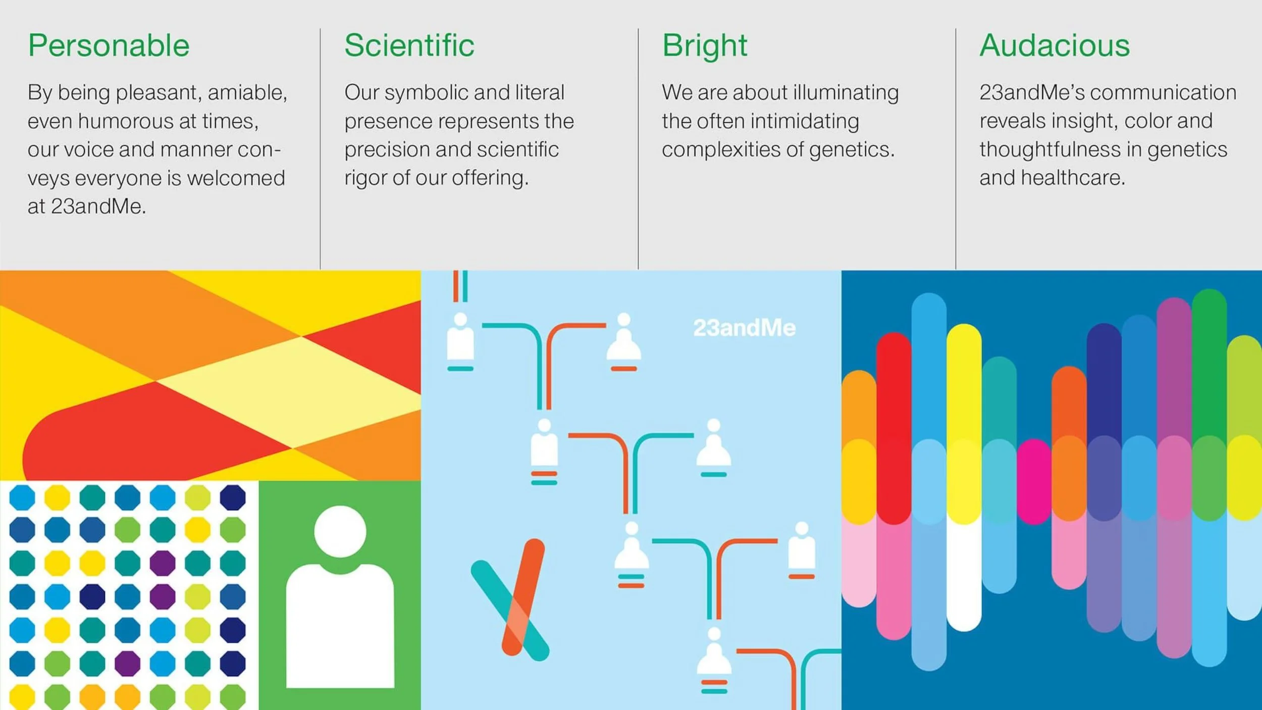
This project presented an opportunity to differentiate 23andMe from the stark, clinical visual language common in healthcare and biotech. The goal was to create a dynamic identity system that could:
Make genetics feel understandable and accessible to consumers
Signal legitimacy through structure, clarity, and consistency
Scale across products and communication needs without fragmenting
Visually reference DNA in a way that felt modern, friendly, and credible
OUTCOME
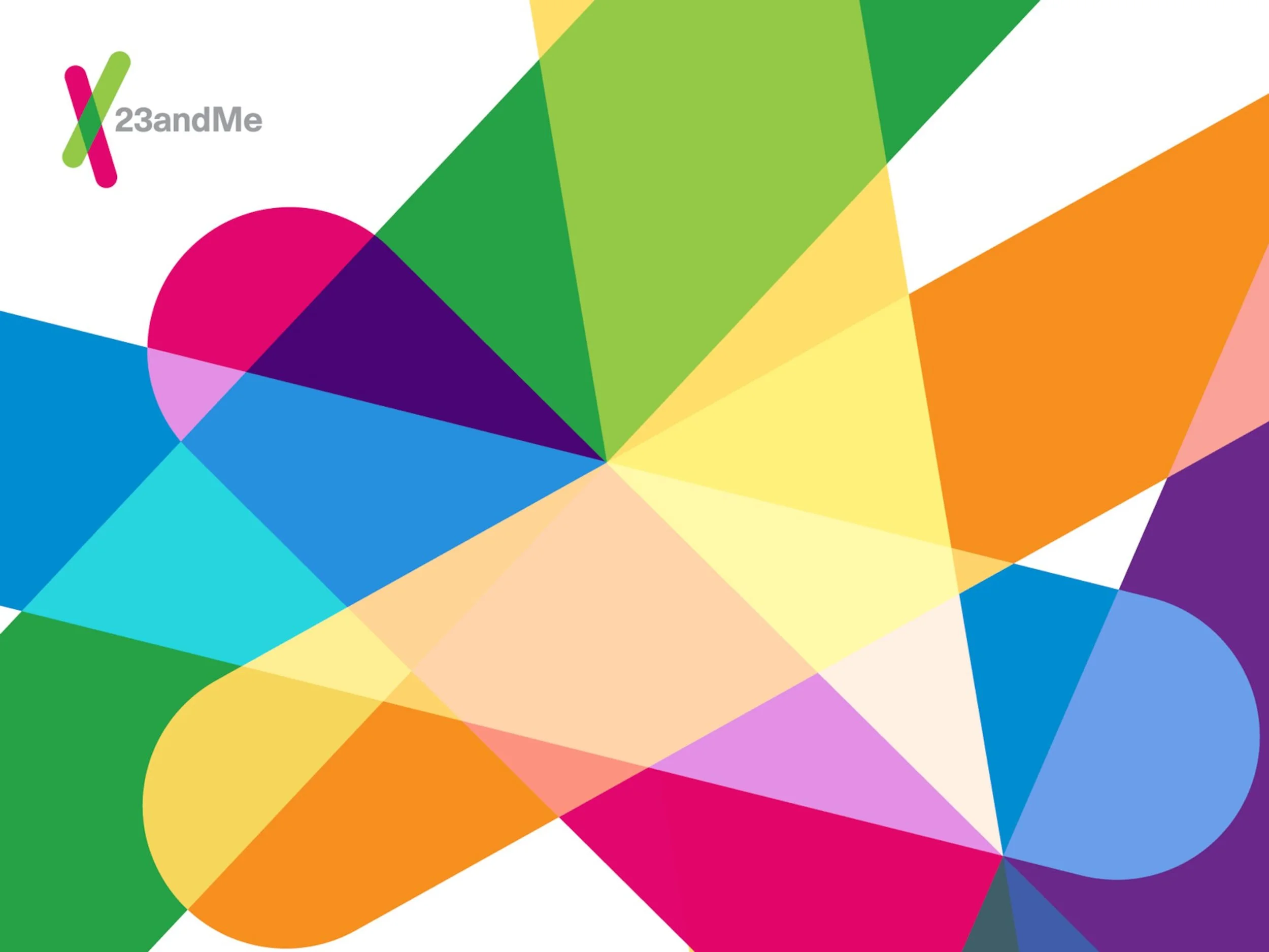
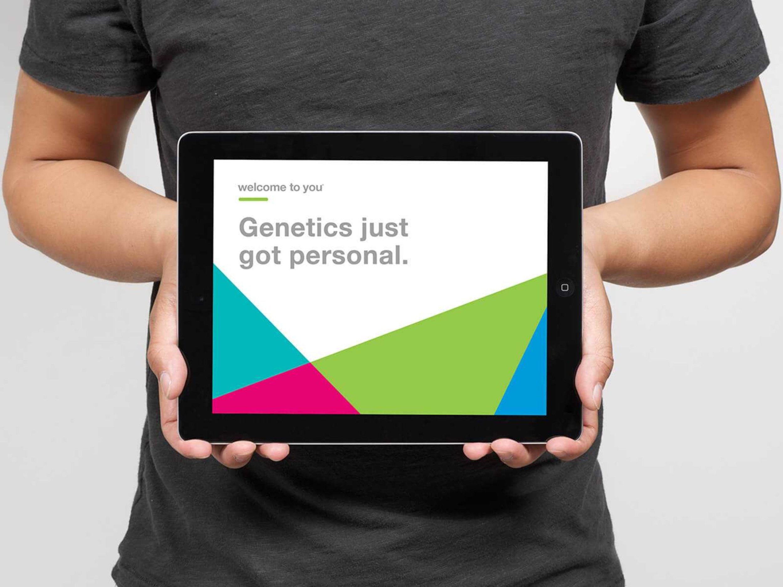
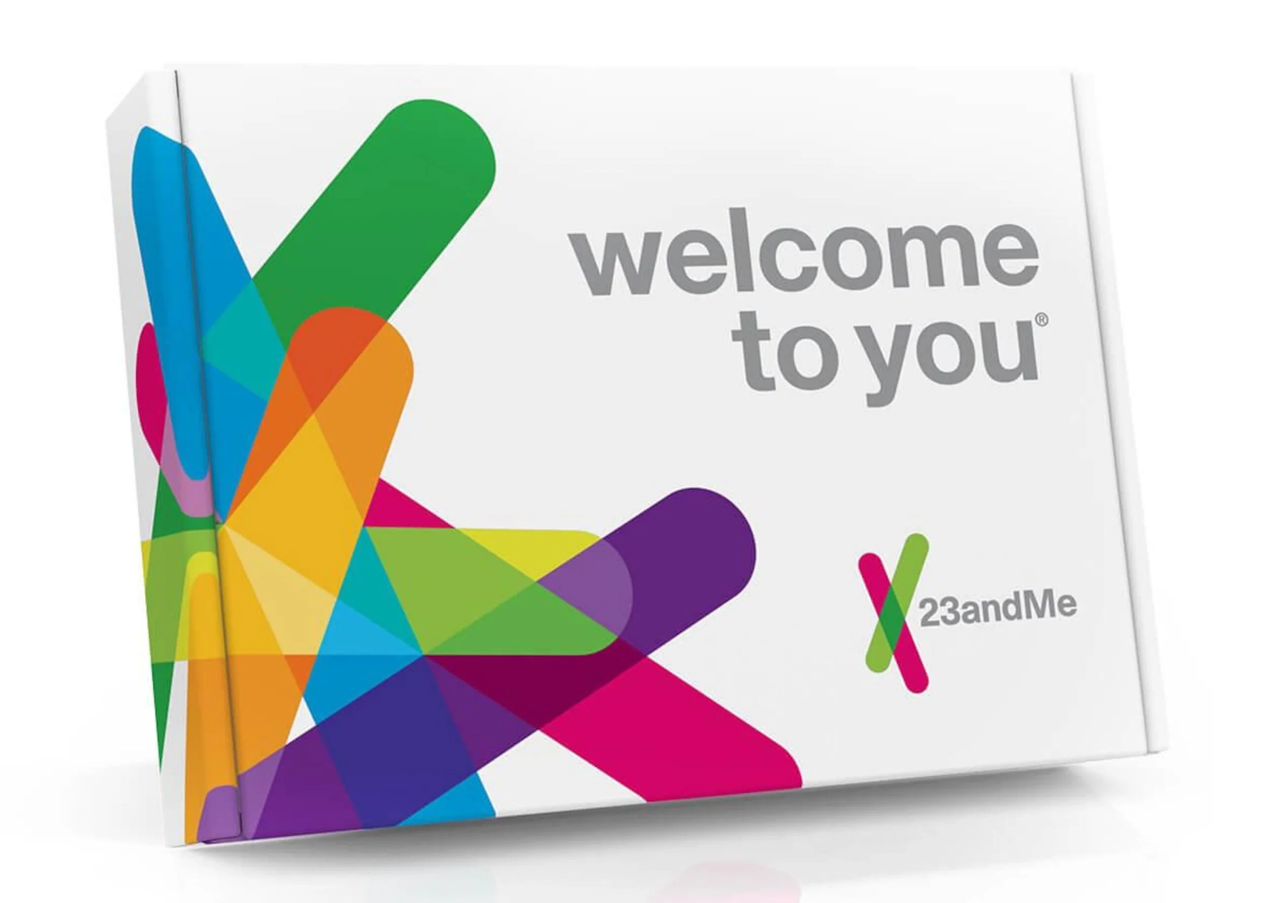
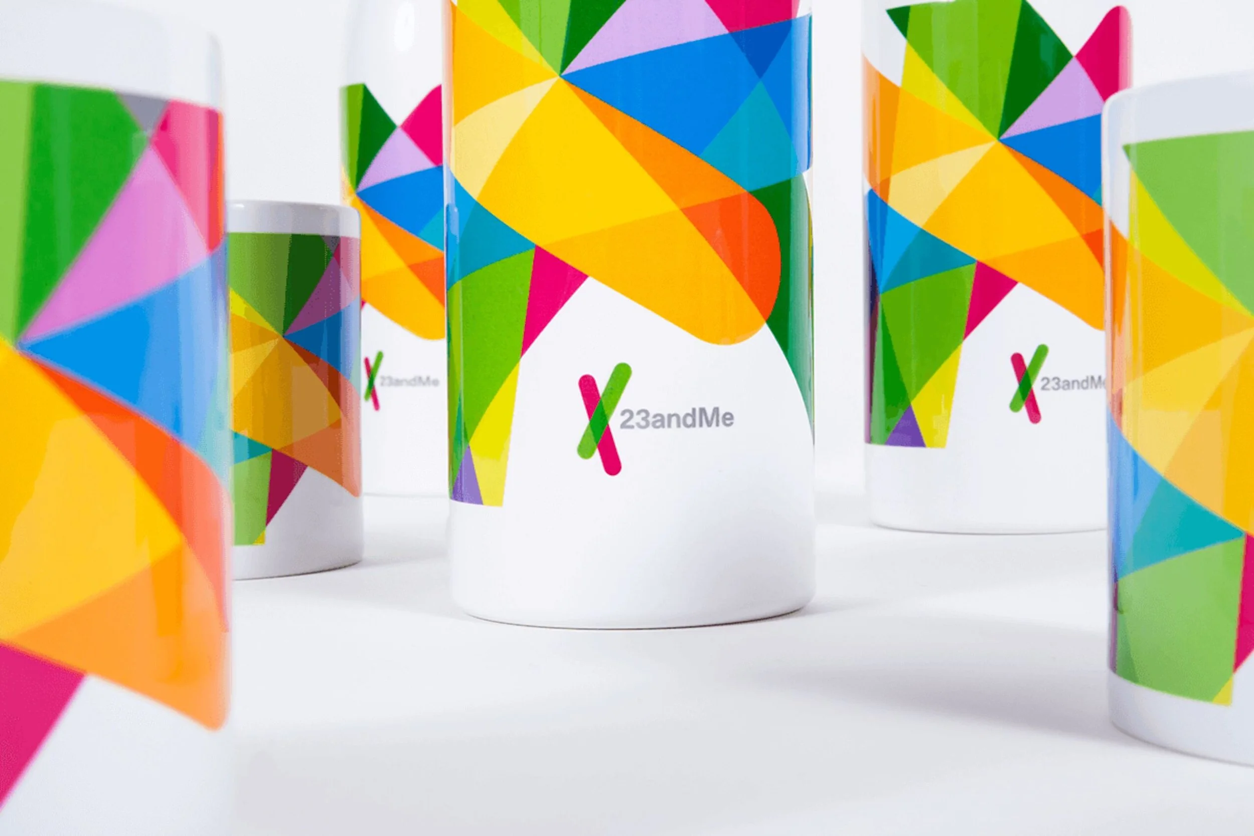
We developed a dynamic brand identity system built around 23 distinct yet unified logo variations, referencing the building blocks of DNA in an approachable, modular way. The system balanced warmth and clarity with a structured visual language designed to reinforce scientific trust. Alongside the identity, I contributed to the system guidelines to ensure the brand could scale consistently across touchpoints while maintaining recognition and coherence in an emerging category.
VISUAL IDENTITY
PUBLICATION


PACKAGING
RESULTS
The new identity helped reduce intimidation around personal genetics by presenting the science through a clear, friendly, and consistent visual system—supporting stronger consumer understanding without sacrificing credibility. The flexible logo framework and guidelines enabled 23andMe to distinguish itself within the healthcare landscape while remaining scalable across future brand and product needs.
REFLECTION
Designing in consumer health requires more than visual differentiation, it requires building trust. This project reinforced the importance of creating systems that are both emotionally accessible and structurally rigorous. I learned how to translate complex scientific concepts into clear visual frameworks, and how consistency across touchpoints becomes a credibility signal in healthcare-adjacent brands.