

A brand identity system for scientific storytelling
Built for clarity, credibility, and repeatable use across research communications.

CLIENT
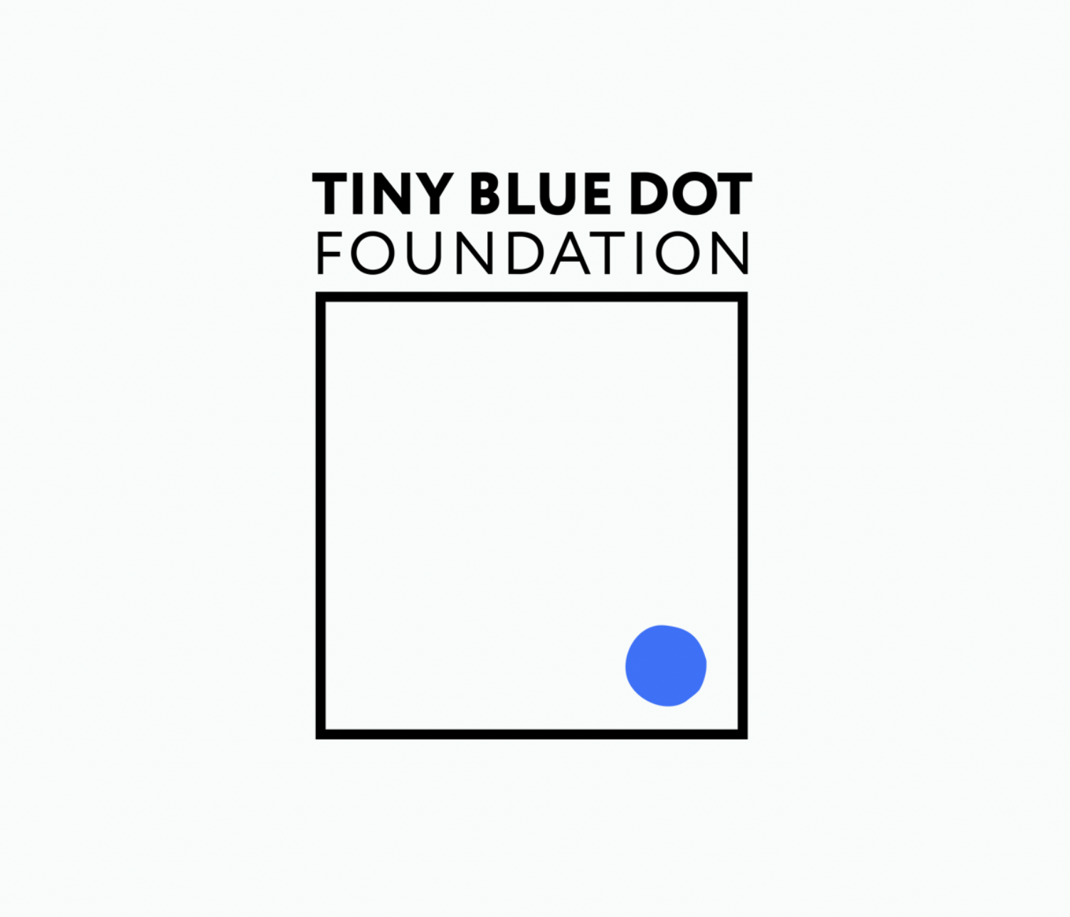
Tiny Blue Dot Foundation
Sector
Scientific Research (Neuroscience, Consciousness, and Perception)
Role
Brand Designer — Identity Lead (Strategy Support)
CREATIVE SERVICES
Brand Strategy & Identity
CHALLENGE
Tiny Blue Dot Foundation operates in a complex scientific space—researching perception, consciousness, and neuroscience—where credibility and clarity are essential. Communicating this work to multiple audiences (research applicants, donors, and collaborators) required a brand system that could feel rigorous and trustworthy without becoming overly academic or inaccessible.
Key constraints
Designed for clarity across scientific + non-scientific audiences
Built to scale across lean internal teams using templates and repeatable rules
Created for consistent use across presentations, reports, and digital touchpoints
OPPORTUNITY
This project created an opportunity to strengthen Tiny Blue Dot Foundation’s presence by aligning strategy, messaging, and identity into one cohesive framework.
A clarified brand system
Improve understanding of the foundation’s purpose and research focus
Support consistent communications across digital and presentation formats
Create a distinct visual language that stands out in the research and nonprofit landscape
Build trust through structure, restraint, and repeatable design rules
OUTCOME
I helped develop a strategic brand foundation—grounded in research insights, positioning, and articulated purpose, vision, and values—and translated it into a clear visual identity system. The identity uses a simple frame-and-dot mark to reflect perception: a defined context (the frame) and a focal point of attention (the dot). The system was intentionally minimal and structured to reinforce credibility, while the dot introduced flexibility across formats and touchpoints.
DELIVERABLES
Identity system + logo lockups
Typography + color system
Slide/presentation template (talks + webinars)
Report/publication layout
Social/digital templates
System components
A modular grid, restrained palette, and repeatable typography hierarchy supported consistency across slides, reports, and digital templates.
MY CONTRIBUTIONS
Identity design + system rules
Template design (slides + reports)
Brand rollout guidance for internal use
BRAND IDENTITY
RESULTS
Improved consistency: Enabled a unified visual language across research and donor communications
Increased clarity: Made complex research easier to understand through structured layouts and messaging hierarchy
Accelerated production: Provided templates that reduced friction for ongoing webinar and grant communications
Adoption: Used across webinar slides, grant cycle materials, and donor-facing updates
REFLECTION
This project reinforced that designing for scientific research requires balancing two things at once: precision and accessibility. I strengthened my ability to translate complex, abstract subject matter into a system that feels credible, structured, and human—while remaining flexible enough to support evolving research communications as the organization grows. If expanded, I would extend the system into motion and data visualization patterns to support research storytelling across more formats.