
Unifying SES into one global brand system
Following a major restructuring, I helped consolidate SES Astra and SES World Skies into a single scalable identity, built to perform consistently across digital, print, and environmental touchpoints.
client
Société Européenne des Satellites (SES)
Sector
Global Satellite Communications (B2B)
Role
Brand Designer (Brand System Lead)
CREATIVE SERVICES
Brand Identity System, Brand Guidelines, Digital & Web, Marketing & Publication Design, Spatial & Environmental Applications
CHALLENGE
Following a major corporate restructuring, SES needed to unify two legacy organizations—SES Astra and SES World Skies—into a single global brand. While both entities were technically advanced, fragmented identity systems made it harder to communicate SES’s scale, reliability, and leadership in an increasingly competitive market. The challenge was not only visual consolidation, but building a brand system strong enough to scale across regions, business units, and physical-to-digital touchpoints without losing clarity, trust, or adoption across enterprise stakeholders.
OPPORTUNITY
This transition created an opportunity to reposition SES as a singular, future-facing global infrastructure provider rather than a collection of legacy satellite services. The goal was to design a flexible framework that could evolve with the business while remaining intuitive for long-term internal use.
A unified identity system:
Clarify SES’s role as a modern, global technology leader
Enable consistent execution across teams, partners, and channels
Support expansion into new markets, products, and platforms
OUTCOME
I contributed to the development of a comprehensive visual identity system that unified SES’s legacy brands into a single, scalable framework, while partnering with MetaDesign as part of a multidisciplinary team to support global rollout and adoption. The system was designed to operate consistently across digital, print, marketing, and environmental applications, enabling SES to present a cohesive presence across regions, business units, and physical touchpoints.
I supported the translation of brand strategy into modular design elements, including logo usage, typography, and visual language that could be applied flexibly within diverse contexts, from communications and publications to spatial and signage environments. Clear guidelines and toolkits supported internal teams and external partners in implementing the identity accurately and efficiently at scale.
The resulting system strengthened SES’s positioning as a modern, reliable global infrastructure provider, while functioning as both a strategic asset and an operational framework that could evolve alongside the organization’s growth.
BRAND STRATEGY
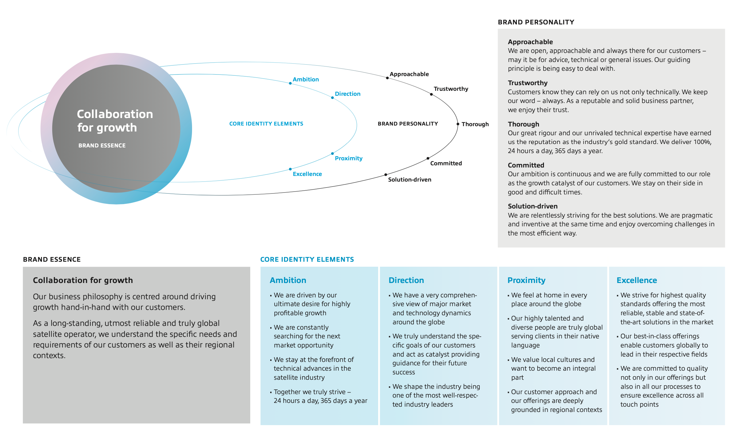
The business decision to align all divisions of the SES organization under a single management structure necessitated the creation of a powerful SES master brand on a global scale. The SES master brand is instrumental in achieving improved clarity and consistency of offerings towards different customer segments and their specific needs. While optimally serving existing segments and future growth areas, it is designed to leverage synergies between different offerings.
BRAND ARCHITECTURE

BRAND IDENTITY
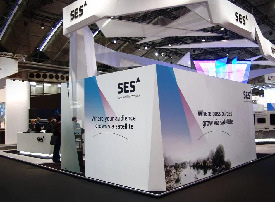
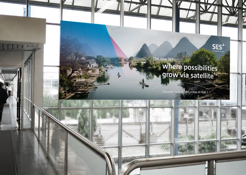
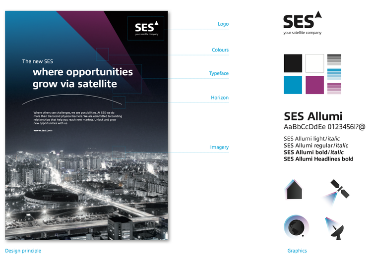
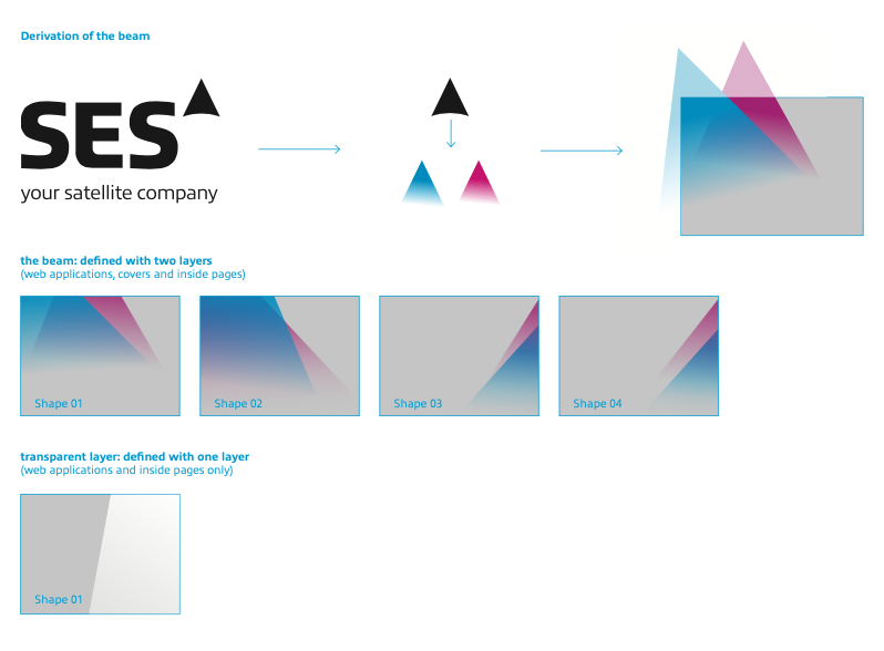
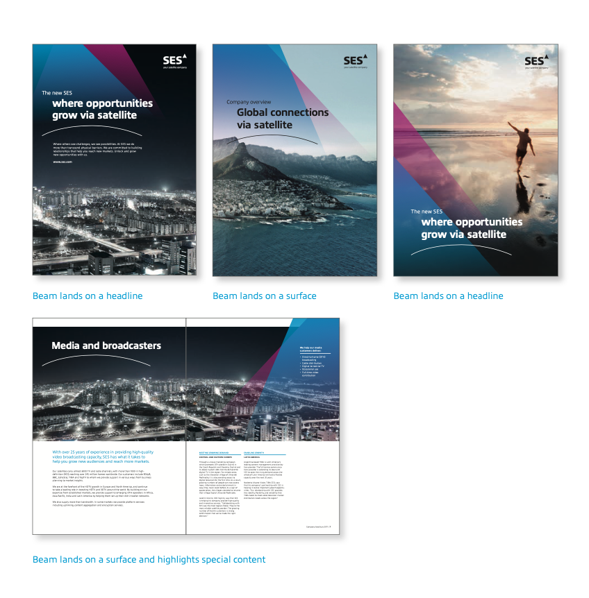
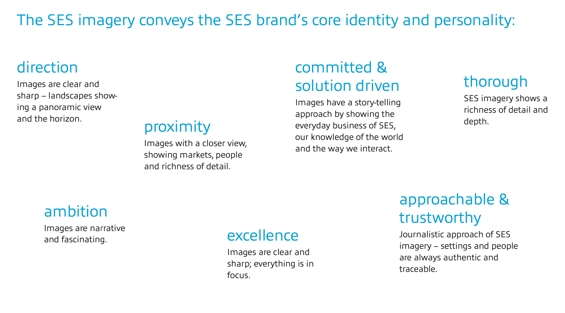
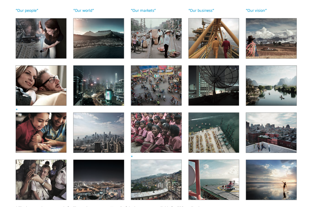
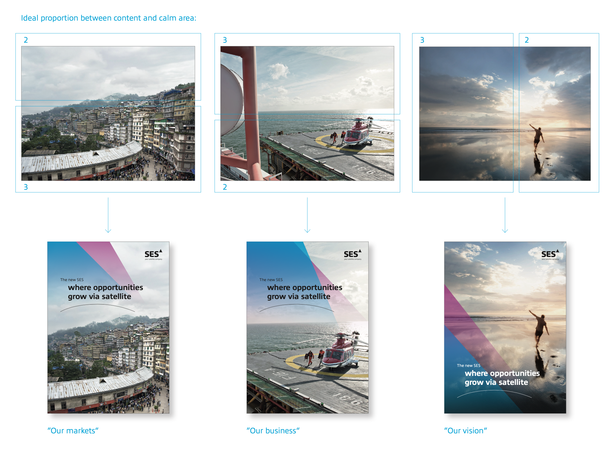
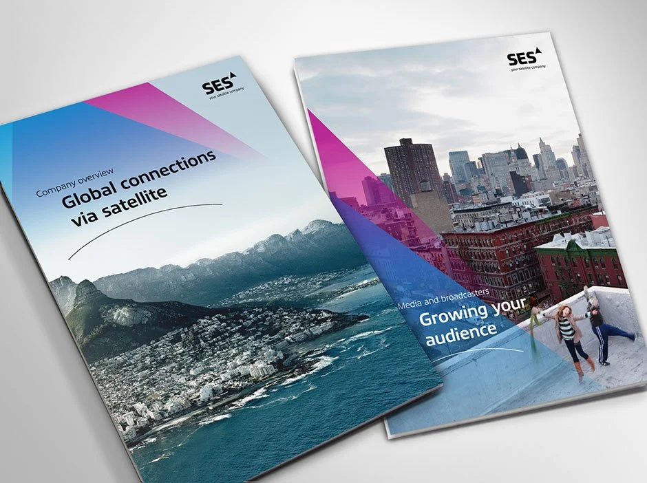
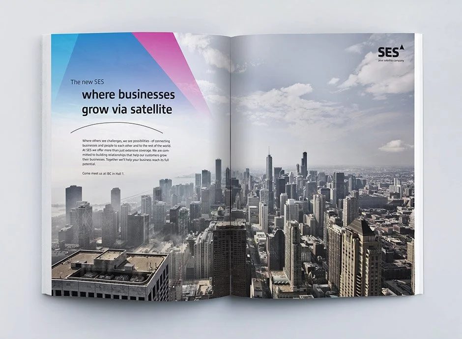
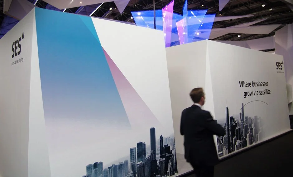
The brand’s key visual element is the beam, it shows the way forward and moves beyond borders. The beam is predefined in a beam shape with two layers, transforming everything it touches, thus revealing the positive impact of SES.
BRAND NAME / CLAIM
The symbol (beam) unifies SES into one strong umbrella brand. The typography conveys approachability and combines technology with a human touch, as seen in the contrast of sharp and rounded edges in all letters.
TYPOGHRAPHY
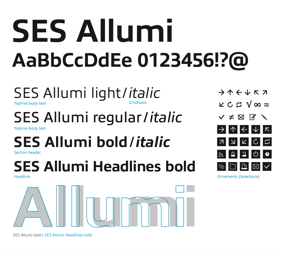
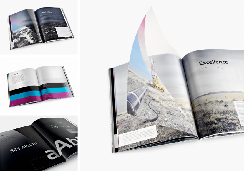
SES Allumi is a sleek typeface designed with technology in mind. The SES Allumi shapes are neither perfectly round nor geometrically square. It’s a human design with a high tech touch.
PURPOSE, VISION & VALUES

BRAND GUIDELINES
MARKETING & PUBLICATION
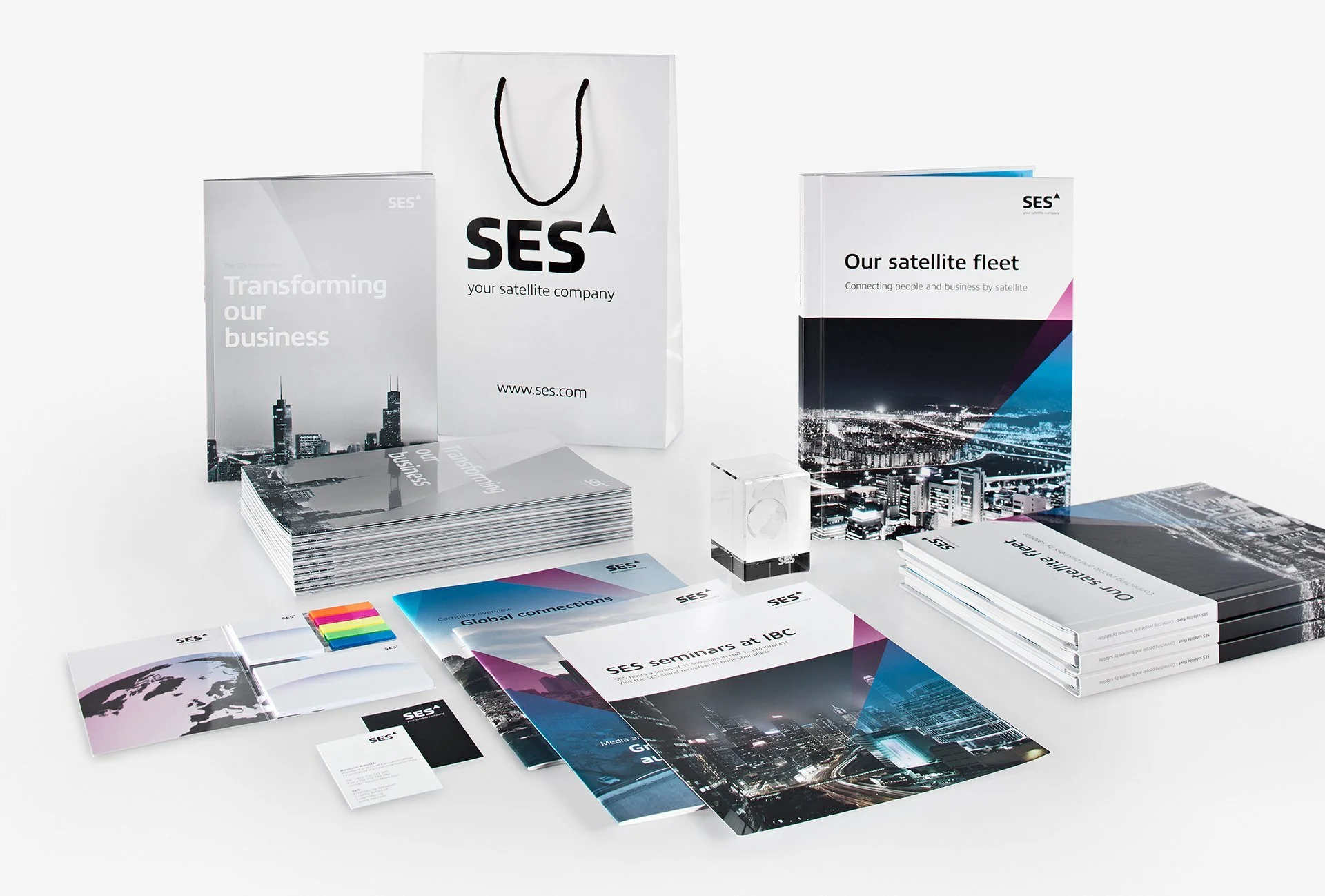


SPATIAL & ENVIRONMENTAL

DIGITAL EXPERIENCE


RESULTS
Supported the successful unification of SES’s legacy brands into a single global identity system adopted across teams and regions.
Enabled consistent application of the brand across digital, print, marketing, and environmental touchpoints through clear guidelines and toolkits
Contributed to an efficient three-month rollout in partnership with MetaDesign, supporting alignment across internal stakeholders and external partners
The rebrand received industry recognition, including the Corporate Design Award and Rebrand Award, reinforcing the strength and clarity of the new system
KEY LEARNINGS
Translating brand strategy into a modular identity system that can scale across regions, platforms, and environmental applications
Applying brand guidelines consistently across digital, print, and spatial contexts to support clarity, recognition, and long-term usability
Strengthening production awareness by preparing and quality-checking assets for cross-media use, including print and digital specifications